How To Apply Design Principles To Online Learning
One of the first things you learn in traditional art and design theory is the elements and principles of art and design. The elements are simply the tools you have available to create something, such as line, shape, space, color, and texture. In contrast, the principles are a set of 7 guidelines on how to use these tools to create a good composition. These guidelines are timeless and hold a lot of value in various disciples of design. You’ll find that all good designers use them, whether they’re aware of it or not.
So, if these guidelines are so universal, how can they help us create better-designed learning experiences?
The answer is surprisingly simple: We need to ensure we consider each principle when creating and designing digital learning content, not only from a design perspective but from a learning one too. This will provide us with a blueprint for creating more engaging and better-designed learning experiences.
Let’s start with what these 7 design principles are:
- Balance
- Movement
- Contrast
- Proportion/scale
- Alignment
- Repetition/pattern
- Unity
So how do we apply each principle?
1. Balance
Balance is the distribution of visual elements in an aesthetically pleasing way.
If we think about balance from a learning perspective, balancing the types of content we use in an experience is really important. We need to cater to a variety of learners, using different modalities. So in this sense, balance would be thinking about how to use different mediums to reach a variety of learners and keep an experience interesting. This could mean using a balance of audio, visuals, gamification, video, animation, and text to create a more powerful learning experience.
From a more visual standpoint, balance refers to arranging elements to create an impression of evenly distributed weight. This doesn’t mean designs need to always be symmetrical to feel balanced. Some simple ways to create balance in your learning is to ensure that elements that are in the same conceptual or functional category are presented in the same way. For example, you have three icons to show three different landmarks on a page, these icons should all be the same size and color palette and be evenly distributed to create a sense of balance.
Likewise, if you have a next and previous button, as well as a home and exit button, these should all be of equal size and in a similar style. This will help create balance (and unity) unless you’re trying to draw attention to one in particular.

2. Movement
Movement is a way to draw the learner’s eye to specific elements on the page or to create a sense of motion.
Movement has a few functions in learning and design. Movement can help create visual interest, helping your experience look less static by having certain elements animate in or out of the page to create visual interest.

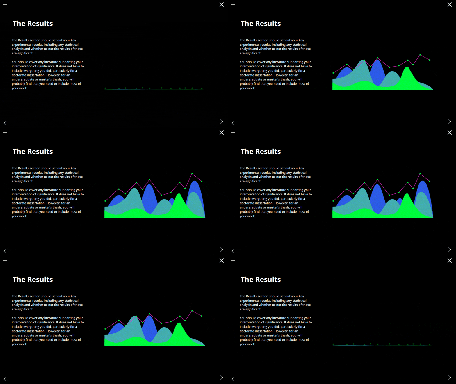
Movement can also mimic the real world, more like animation. For example, having a countdown timer that mimics the movement of clock hands. Movement can also show the connections between ideas or draw attention to certain elements, such as having a graph or key icons animate in.

However, if overused, movement can also be a source of frustration or distraction. Imagine landing on a page and having to sit and wait for every single line of text to slowly fade in before you can read it, or having multiple different elements all fading, spinning and growing while you’re trying to figure out what to focus on.
Just because you can use movement, it doesn’t mean you always should.
We need to think like web designers. We’re designing learning in a highly digital age, where most learners spend the majority of their day online. Our digital learning is competing for their attention with the world’s best-designed websites. Look at popular websites or web design and see how they utilize motion and animation. Consider this example of web design from Zak Steele-Ekund. Movement should be slick, subtle, and professional and most importantly, not overpowering.
3. Proportion/Scale
Proportion or scale simply refers to the relationship between objects with respect to size.
This is a simple one if you’re trying to draw the human body but might seem a bit strange in terms of learning or design. Don’t let it fool you, this simple principle is one of the most important, and also the one that’s so often overlooked.
Changing your font size a pixel here or there, or trimming a couple of inches off your next button so that it fits on a tricky page can seem inconsequential to you, but when you’re going through a course as a learner, and your fonts are jumping sizes and buttons are constantly changing, it’s nothing if not distracting. We don’t want our learners to get distracted from the learning by our design. No, if anything, design should aid the learning.
An easy way to ensure consistency in scale is to set rules for your text sizes, certain image sizes and button sizes, and most importantly—stick to them.

4. Alignment
Alignment in design refers to how elements are placed on the page. Alignment is where grids become your best friend (and sometimes your worst enemy).
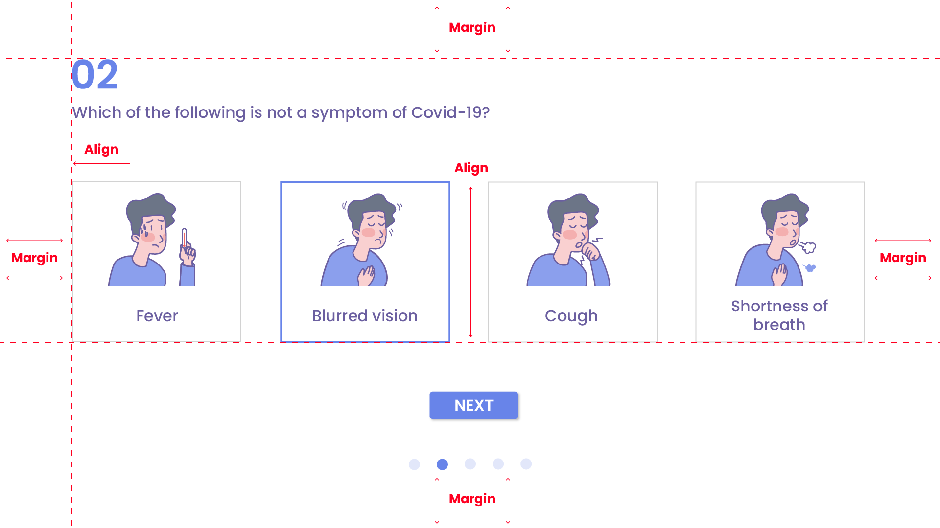
From a design perspective, alignment simply means that everything on the page should be lined up with elements near it, either horizontally or vertically.
Elements should not only be aligned to each other, but also to margins. Margins are simply invisible white spaces all around a page that should always be kept clear. These should be kept consistent on all pages.

From a content point of view, we should consider if the content and the delivery method we’re using aligns to the learning outcomes we are trying to achieve. With digital learning and its endless possibilities, it’s easy to get caught up with the design and delivery of content and this has the danger of us losing sight of the learning goals.
5. Contrast
Contrast is using two opposing elements to draw attention.
From a design perspective, this would be using white text on a black background so that it stands out, or using pink and green together as they are contrasting colors on the color wheel. Contrast is a powerful tool to draw attention to important elements on the screen and to guide a learner’s attention. It’s also very important for accessibility, ensuring that content is legible for all learners.

From a content point of view, using contrast is really helpful. Giving learners clearly contrasting examples and metaphors can be very memorable and grab their attention. There is often a lot of grey area in learning content, so where it’s clear cut, it can be refreshing to provide clear and contrasting examples to illustrate a point.
6. Emphasis
Emphasis is drawing attention to a specific element, making it appear more important. This can be done using contrast, scale, color, movement, and placement.
In design, you want to place emphasis on the most important parts of the page. However, if you overuse emphasis, drawing your learner’s eyes to everything on the page, your learning experience will look like an over-highlighted textbook where both everything and consequently nothing appear important.
Much like emphasizing everything, emphasizing nothing can be very confusing and overwhelming to a learner. Without knowing where to focus, a learner might open your course and not know where to look or start, and feel overwhelmed by the amount of content in front of them. But, if you create a visual hierarchy, guiding the learner through the content by emphasizing what to consume when, the content appears much more manageable—and interesting.
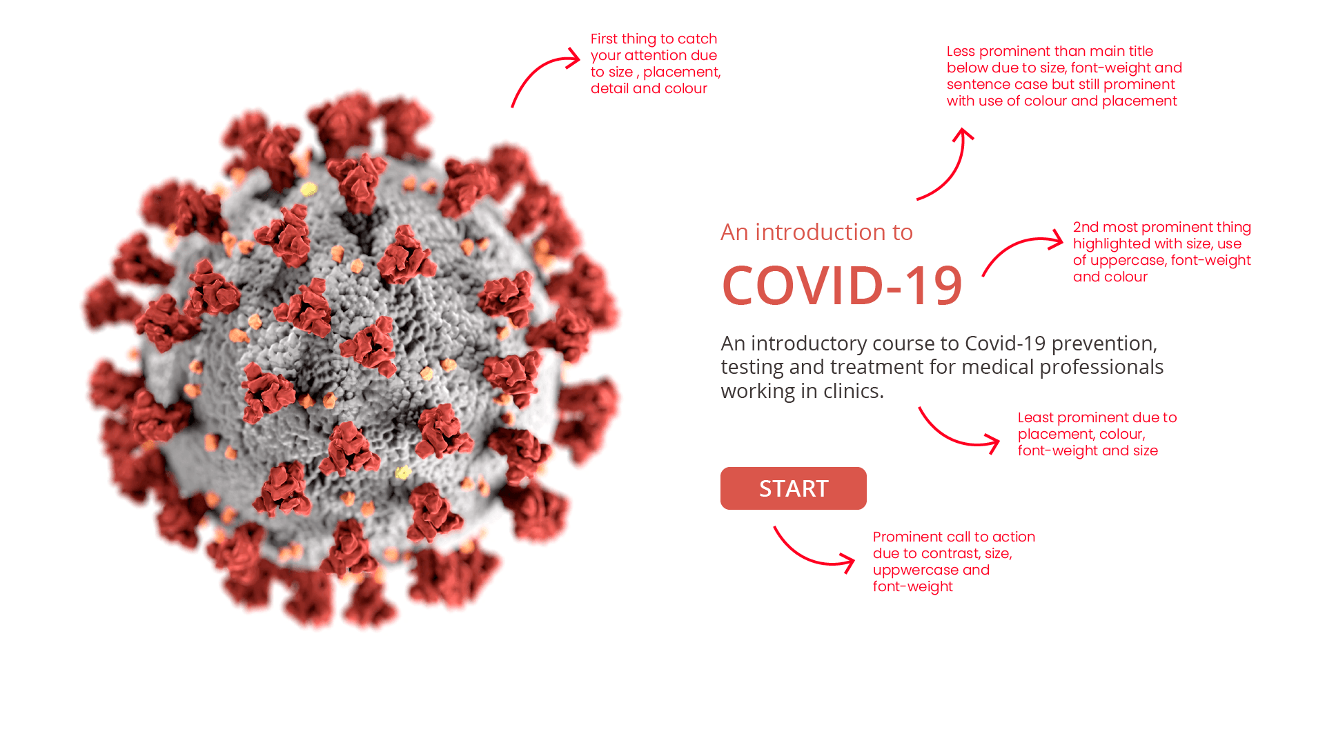
Consider this cover page:

Hierarchy and emphasis are established with the use of size, color, font-weight, capitalization, contrast and even detail. The COVID virus is what first draws your attention, being the largest, most detailed element on the page, in full color. Next, your eye is drawn to the heading « COVID-19 » due to its color, font-weight, size, and use of uppercase. Slightly less prominent than that is the text above it reading, « An introduction to. » This is made less prominent than the main heading as it is smaller, thinner, and in sentence case.
The course description is the least emphasized element on the page, being in black, having a thin font-weight and size and being placed below the more important text. Lastly, the Call-To-Action, the start button, is emphasized with the use of solid color, size, font weight, capitalization, and contrast.

In this way, information hierarchy is created and emphasis is placed on different elements on the page, helping the learner know what to focus on and when. This should be done throughout the learning experience to help guide the learner and emphasize the important learning content at the correct stages of the learning journey.
6. Repetition/Pattern
Repetition or pattern refers to the use of similar or connected visual elements. This is a powerful way to reinforce a message, both in the learning content and design.
In terms of design and user interface, having repetitive elements helps to create a consistent User Experience. This means keeping navigation buttons, menu items, and logos in the same position on every page. Repeating items like this helps to keep the User Experience consistent and ensures that learners don’t use their cognitive load trying to figure out how to navigate through a page, but can use it to absorb the learning content.
In terms of visuals, repeating graphics or icons that have been used to create visual associations with concepts can be a powerful learning tool. Repeating these throughout the learning content allows you to use visuals to convey meaning without always having to use words. For example, you could associate achievements with a trophy icon. This means that you would repeat this icon whenever the content references achievements to help reinforce the message. Changing this icon to another visual such as a badge will break the visual association.
Much like in the use of visuals, repetition in learning content is also very important for reinforcement. By repeating and recapping the sections of the learning content throughout the learning experience, you help reinforce the key messages you want the learners to focus on. This can mean presenting or explaining the same content in various ways, asking multiple different questions on the content throughout the experience or adding in recap sections to draw attention to the main takeaway points of the learning.
7. Unity
Lastly, unity ties everything together, creating a sense of harmony and consistency in your design.
From a learning perspective, unity would mean a common thread and cohesiveness in your learning experience. That means that any metaphor, theme, or visual association needs to be carried through all your designs. If you’ve decided to compare achieving your goals to running a marathon, you can’t suddenly refer to the process as a sprint or a slam dunk. Keep it consistent.
The same goes for your design. Colors, fonts, and interactions should be used consistently. If you’ve decided to present steps as clickable numbers that reveal text, you can’t suddenly present steps as flip cards. This breaks unity in your design, as would changing your font size, color values, or visual style between pages.
On a higher level, think about the unity of your experience as a whole, how the information is structured, segmented, and presented. Unity should be in everything from tense, tone, language, and all the way through to visual design.
The easiest way to ensure this is done, especially when multiple people are authoring courses at the same time, is to create a learning design system. This is essentially a guide that details how design and language are used in your learning content. It outlines all the design elements such as fonts, colors, icons, illustrations as well as explains how to use them. It also includes guidelines on interactions, language, and tone. A great design system for inspiration is Uber’s extensive design system.
The 7 Design Principles
These 7 principles can be incredibly useful if considered early in the design and development process, ensuring a solid design foundation that not only increases satisfaction and engagement but aids in learning.

